BRANDING
台灣‧全台
Taiwan‧ROC
高露潔 : 品牌形象合作
高露潔 : 品牌形象合作
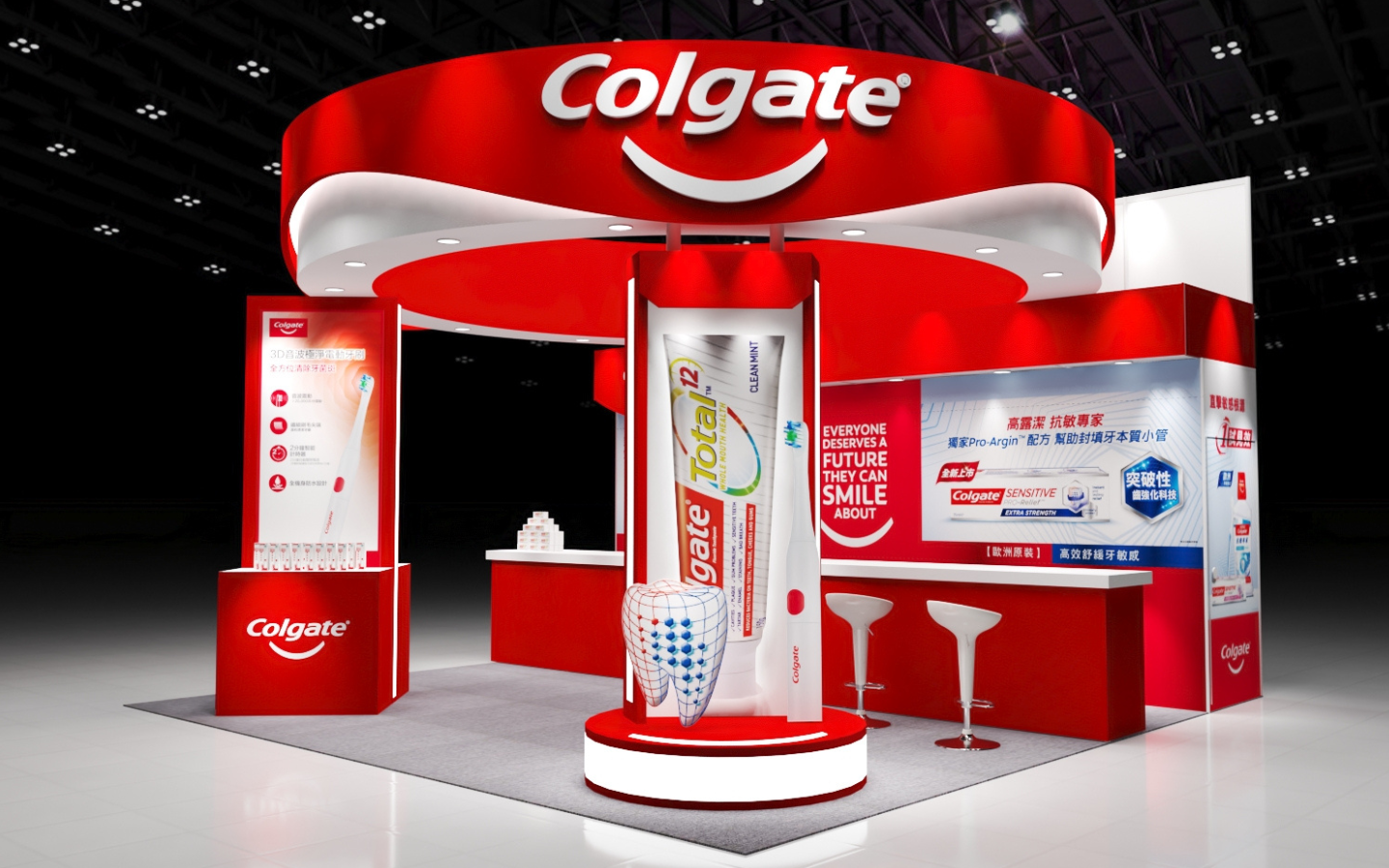
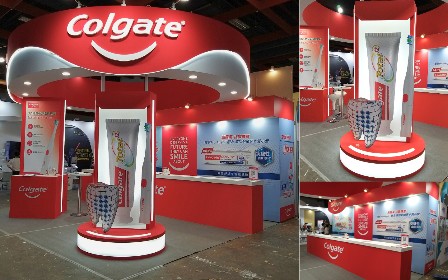
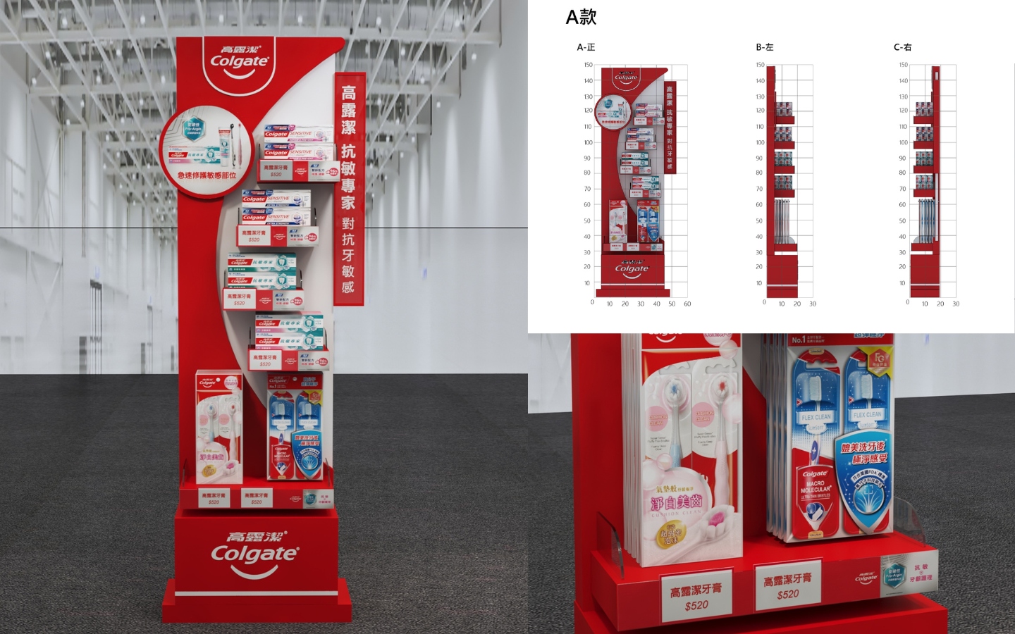
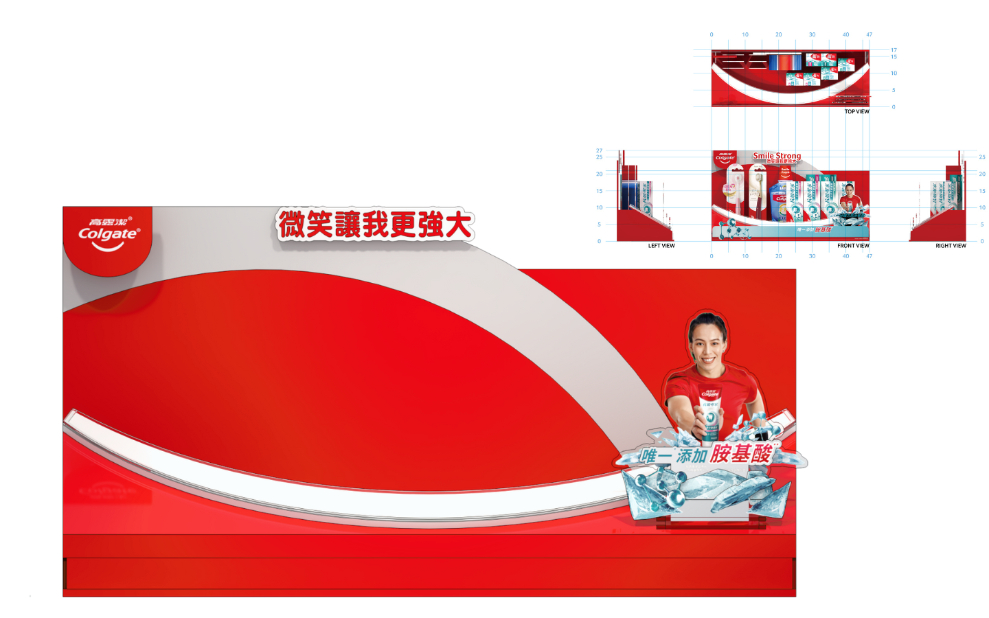
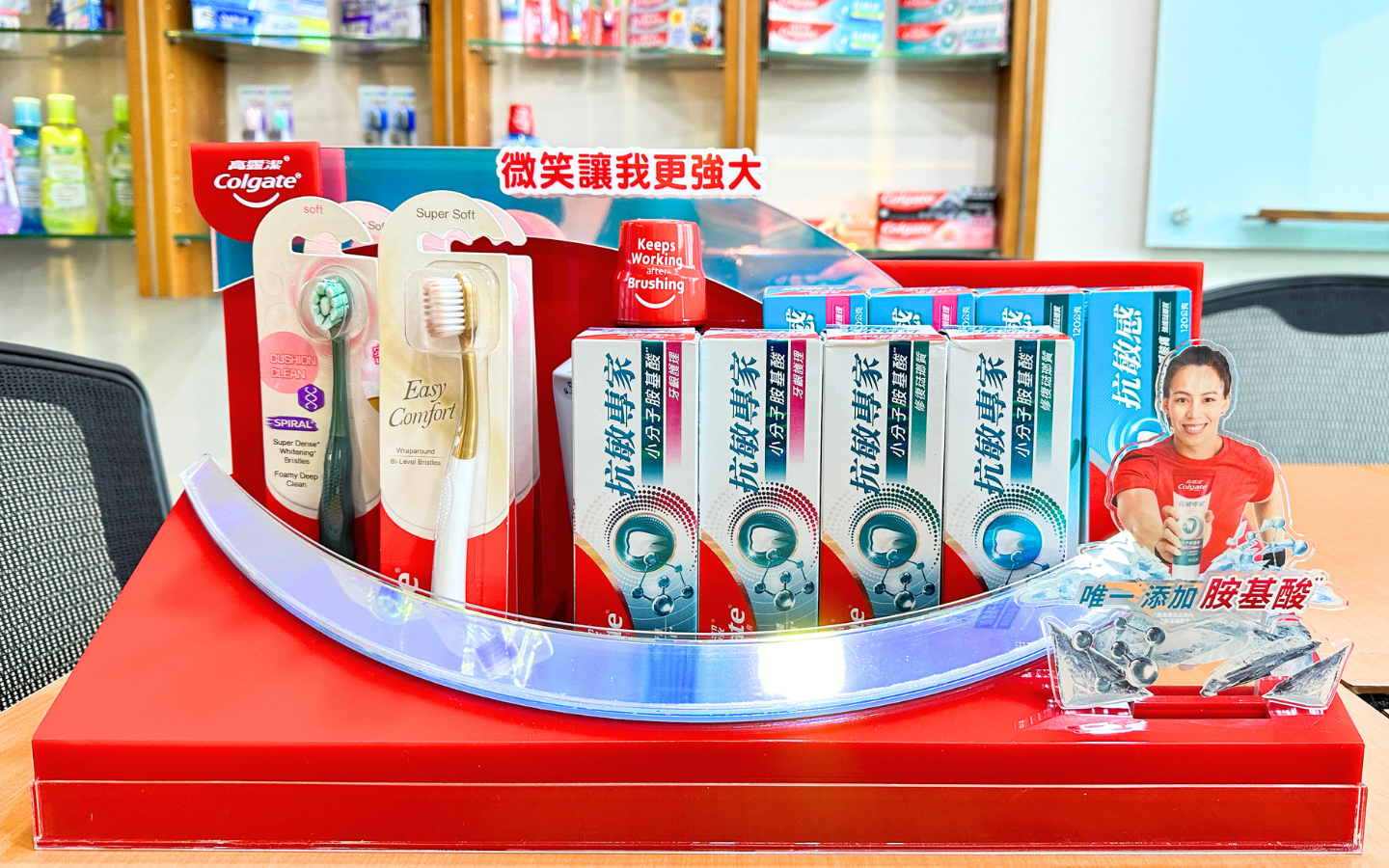
紅白企業形象為基底色,結合品牌信仰,加強圓弧造型勾勒出微笑曲線。給人乾淨專業的質感氛圍,質感挑選與趣味設計並存,增加消費者對於品牌使用安心與幸福感。
Smile Curve, Bright Life
The red and white corporate image serves as the foundation color, which combines with the brand belief to enhance the smile curves outlined by the curved shape. It creates a clean and professional look, balancing texture selection and playful design to increase the consumer's sense of security and happiness when using the brand.
- 合作單位 好來化工股份有限公司
- 專案年份 2019、2020、2021
- 專案地點 台北世貿、全台量販通路
- 合作項目 主題策畫、展架設計/製作
- 內容出處 好來化工、展圓設計
- Sponsor Hawley & Hazel Chemical Co.
- Year 2019、2020、2021
- Location TWTC、Mass retail channels in Taiwan
- Project Theme planning, exhibition area design, and POSM.
- Source H&H、JANYEN